WORD WIZ
What is Word Wiz?
Word Wiz is a fun, interactive language-learning app designed to turn the often-daunting process of picking up a new language into an engaging and enjoyable experience. With gamified features, personalized learning paths, and a touch of whimsy, Word Wiz empowers users to master new languages through bite-sized lessons, playful challenges, and real-life practice opportunities.
Role: Researcher, End-to-end UX/UI Designer
Tools: Figma, Chat GPT, Otter, Adobe Illustrator, Adobe Photoshop, Canva
Timeline: August 2024 - September 2024
___________________________________________________________________________________________________
The problem.
Users need an accessible and engaging way to learn new languages because traditional methods can be time-consuming, unmotivating, and difficult to integrate into daily routines.
We will know this problem is resolved when users consistently engage with the app, achieve measurable progress in their language skills, and feel confident applying their knowledge in real-world scenarios.
___________________________________________________________________________________________________
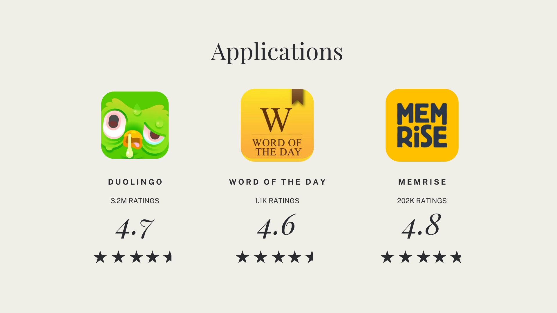
Competitive Analysis
Based on my experience, Duolingo stands out as the most comfortable and effective app for learning new vocabulary. Its clean, vector-based icons and intuitive user interface guide users through challenges without overwhelming them. In contrast, Word of the Day needs significant improvement due to its cluttered design, offering too much content from multiple sources. Memrise falls in the middle; it provides a solid range of learning resources but could be enhanced by offering immediate feedback on users' answers.
___________________________________________________________________________________________________
User Research
Seeking to gain a better understanding of potential users of Word Wiz and what variables impact their decision to install and interact with this mobile application, I wanted to get a better sense of empathy in what makes for a positive language learning experience. Working through user surveys, these were the main takeaways:
1. When was the last time you had to learn a good deal of new vocabulary? Did you succeed? Why or why not?
All interviewees have not learned a new language in quite some time since their schooling days - give or take 10+ years. Most succeeded because of the structure of their curriculum in school.
All interviewees have not learned a new language in quite some time since their schooling days - give or take 10+ years. Most succeeded because of the structure of their curriculum in school.
2. Tell me about a time you’ve been frustrated with jargon and new vocabulary.
By asking users what their frustrations are with other language learning experiences, we can learn what to avoid when creating our own user friendly space for users to learn efficiently and effectively. In this case, most users expressed their frustration came from within themselves and their grade levels they received or their lack of success when it came to spoken word.
By asking users what their frustrations are with other language learning experiences, we can learn what to avoid when creating our own user friendly space for users to learn efficiently and effectively. In this case, most users expressed their frustration came from within themselves and their grade levels they received or their lack of success when it came to spoken word.
3. What motivates you to keep learning a new language or vocabulary? Can you think of a time you felt rewarded to keep learning?
Most users mentioned traveling to be an important motivation to them learning a new language and engaging with their clientele.
Most users mentioned traveling to be an important motivation to them learning a new language and engaging with their clientele.
Research Synthesis
Insight: Users want a fun and validating experience if they are to learn a new language with feedback to help them improve and see results.
POV: As a person looking to expand my vocabulary and learn a new language, I need a simple and structured app that will be able to track my progress and take on the go with me for when I travel.
HMW: How might we develop a platform to help users of all walks of life learn a new language in a fun and structured way?
Who are we
designing for?
designing for?
In compiling my research findings, I was able to narrow down who my users are, their motivations, needs, and pain points.
Meet Laura, our proto persona

___________________________________________________________________________________________________
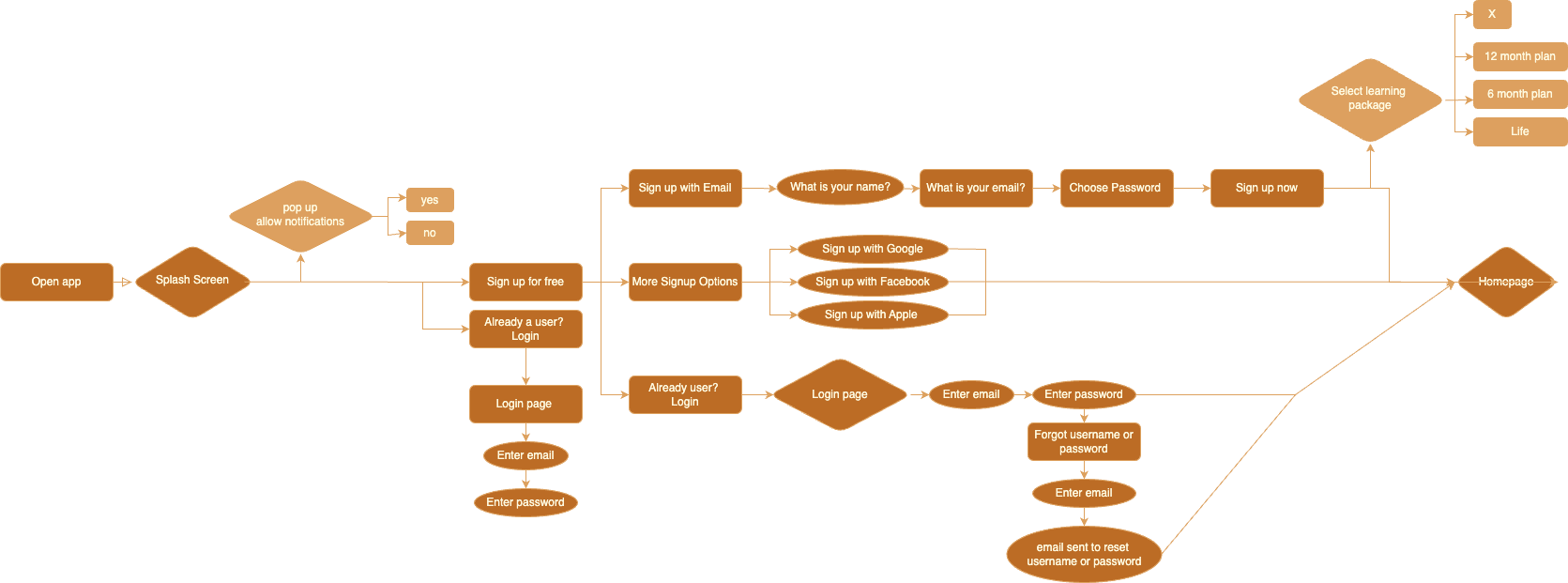
User Flow
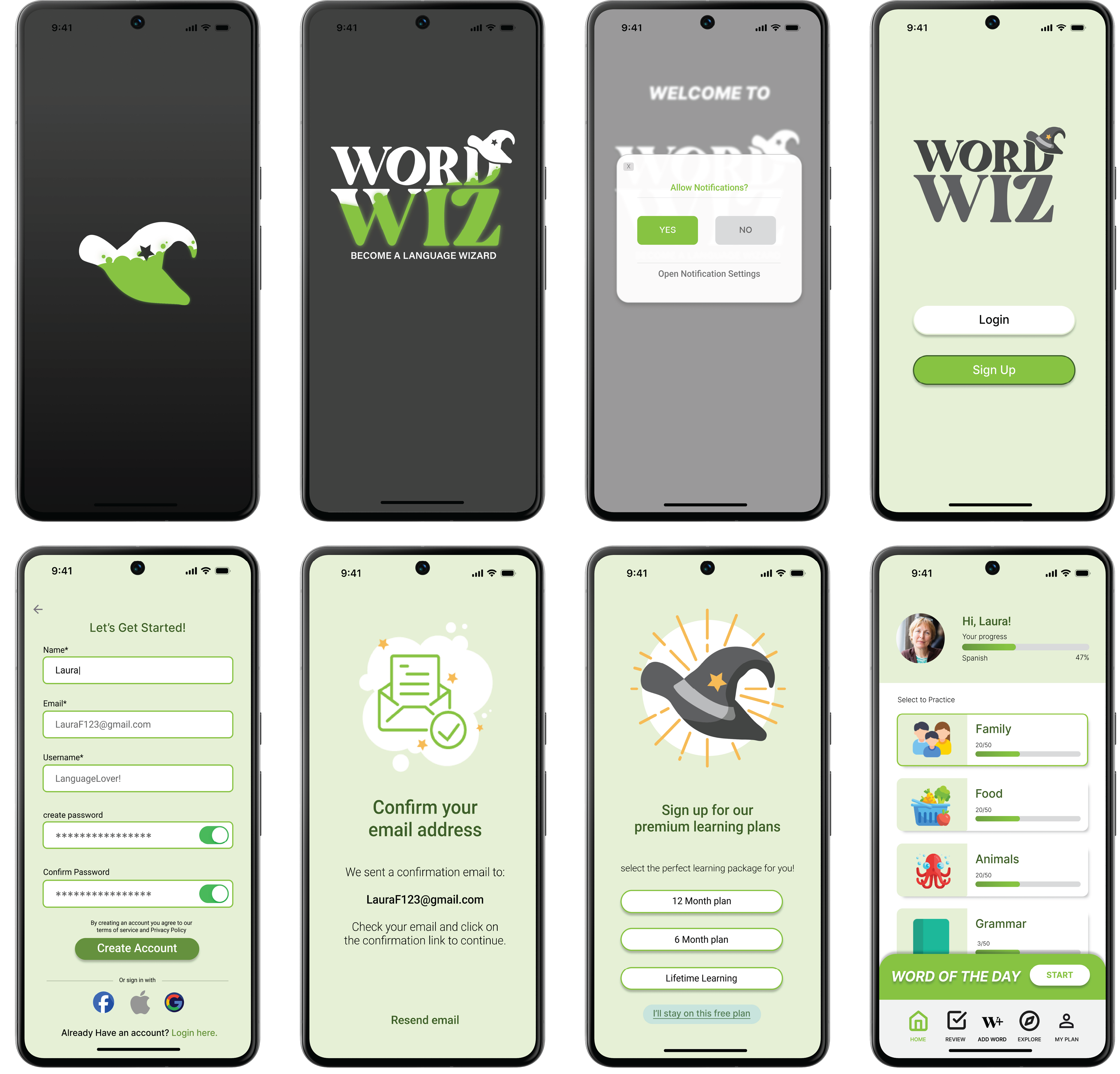
When we think of how our first time users may be introduced to an app, this is how I've visualized what a sign in process for them would look like after downloading WordWiz.
Sign in process:
When we think of how our first time users may be introduced to an app, this is how I've visualized what a sign in process for them would look like after downloading WordWiz.
Sign in process:
___________________________________________________________________________________________________
Low Fidelity Wireframes
First iterations of the sign in process.
First iterations of the sign in process.

___________________________________________________________________________________________________
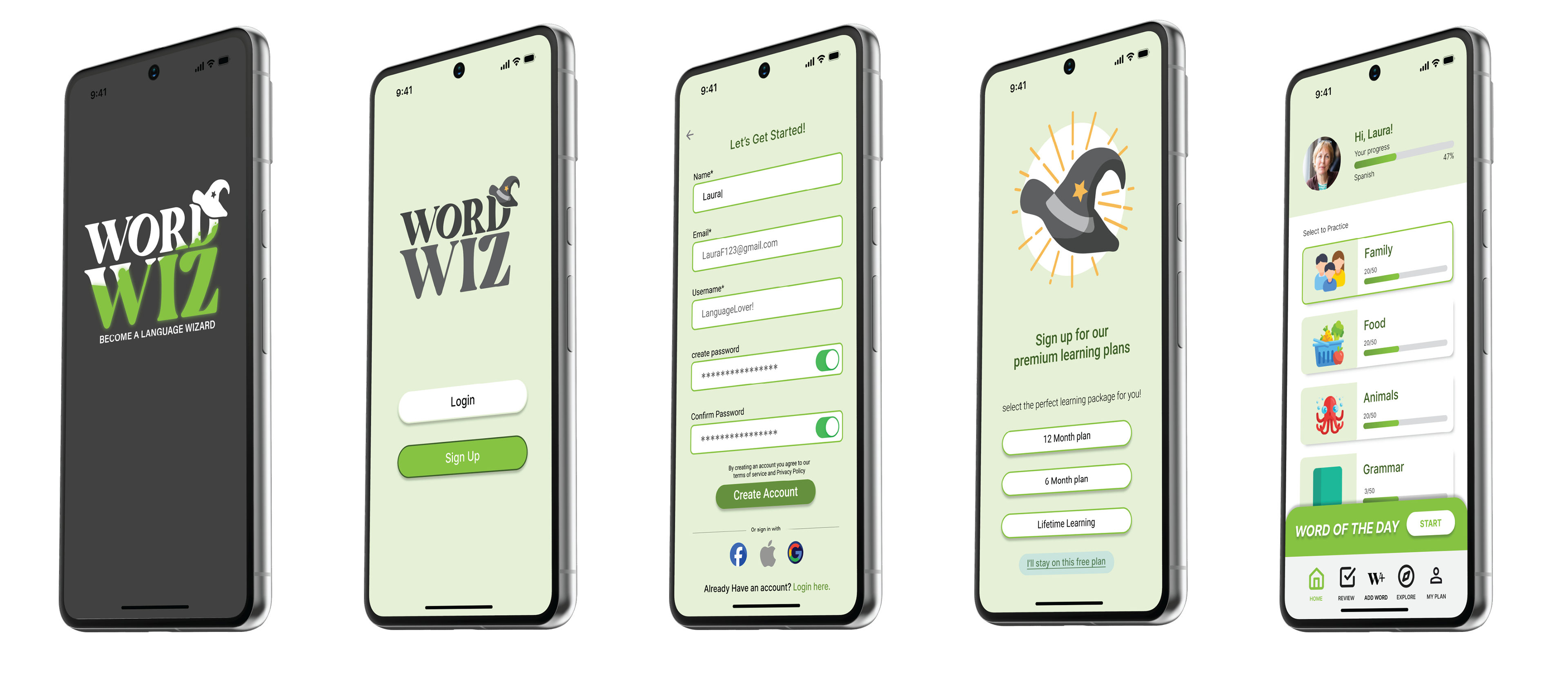
High Fidelity Wireframes
Displayed below is the sign in process as high fidelity wireframes created in Figma with knowledge from user interviews, low fidelity wire frame iterations and a few high fidelity wireframe iterations.
Displayed below is the sign in process as high fidelity wireframes created in Figma with knowledge from user interviews, low fidelity wire frame iterations and a few high fidelity wireframe iterations.
___________________________________________________________________________________________________

UI Kit
Color: Since this is an original brand concept, I had fun with the color spectrum. The learning curve was figuring out how to achieve contrast within this palette. The result is meant to be fun, giving a “spooky” playful feel - picking colors off of the dark grey and vibrant cauldron/ potion green. To stand out among our competitors like duo lingo who have vibrant and fun colors, these colors contrast and will stand out in the app store or a simple google search.
Iconography: All iconography are vector based Adobe illustrator pieces. Also, with competitor’s iconography in mind, I thought it was important to keep the illustration light, playful and of course, vector based. This would make it easier to animate in the
future as well.
future as well.
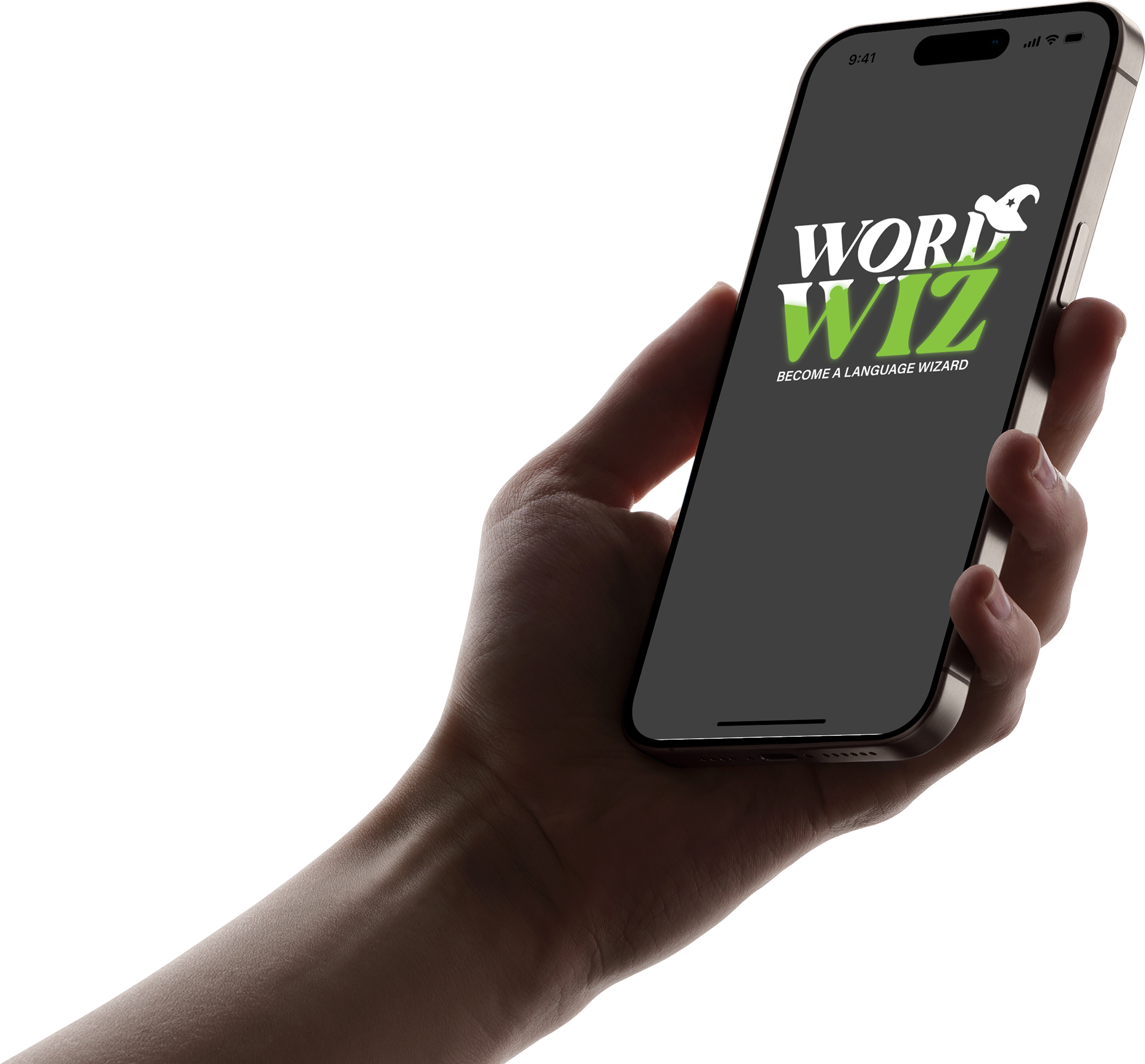
Logo variation: Various logos are included with this kit to pair with the limited background colors. Logos with half of the logo filled in with green “potion” are meant to resemble the loading concept or even splash screen effects that can be edited in at a later time during development. I thought the witches hat added to the personality of the app’s image.
Fonts: The logo is comprised of Bugaki and Acumin Variable Concept fonts keeping it fun and informative. The body text of the app itself is consistently Roboto in various bulks. Upon research, Roboto is one of the most common app fonts and was used here to maintain user friendliness.